
The Last is without doubt my most successful book yet. It has sold close to a thousand copies since release 4 months ago, with several hundred more in Kindle Unlimited borrows, and close to 10,000 copies given away free.
Why is this happening? It surely has been down to three things: title, cover, blurb. In a nutshell- the book’s marketing.
This post is about the marketing path to the current title, cover and blurb.
DESIGN ONE
I started off with a wordy, opaque title which I thought was clever, silly and fun. It tied in perfectly to the book, being the nickname the hero Amo takes for himself after the apocalypse (all very tongue-in-cheek).
LAST MAYOR OF AMERICA
Shall I explain that? It’s foursquare meets the apocalypse. Does that help? Foursquare is the GPS-linked location-based cell phone app, where by ‘checking in’ to a place you can raise your rank there. So if you check in to a place a lot, more than anyone else, you can become the mayor.
So, it’s fun. It’s easy to check in the most when you’re the only person there. But one problem here is how vague it seems- even misleading. Is it about politics? Is it Rudi Giuliani’s memoir? In the book it’s fine to explain, but as a title there isn’t that time.
Anyway- I had the idea I wanted to go big with the title, splashed boldly across the cover background image- which would be a scene of New York in ruins. I was inspired in this by the novel ‘Ready Player One’, not for any particular reason- just I liked that style, and I wanted the ‘fun’ title to do the work for me.
Here’s Ready Player One:
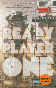
It’s a book I really enjoyed and admire, with some similarities to The Last- in that it’s an odd skew on a quest story, with time jumps that take the character ad story leaping forward.
Here’s my first take:
There wasn’t room for my full name, so I dropped a little MJG in the corner. Ameri-ca is also a bit tricky. I searched for ages for a good image of New York destructed, but couldn’t find any, and so came back to a photoshop tutorial I followed years ago, when I thought I might get into ‘destructing’ photographs for fun.
See that tutorial and my efforts here.
But I soon changed the title, and with it I wanted to change the image. Of course I could have used the same image- but it wasn’t strong enough. So I looked around. Here are some of the covers I got inspiration from:
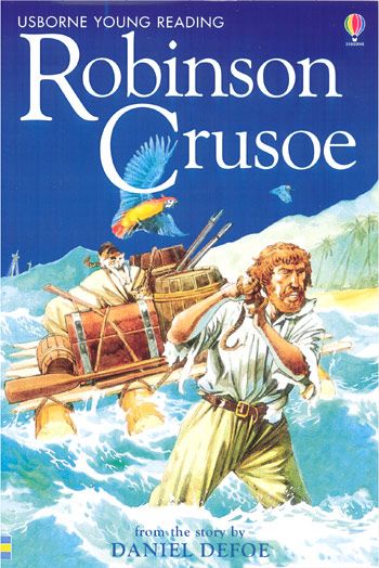
Robinson Crusoe was a definite inspiration for The Last- being largely man against environment. Although perhaps the Tom Hanks movie Castaway was more directly my inspiration. There is even a similar character to Hanks’ ‘Willis’, his friend the basketball.
So I need a character, for the ‘man’ in ‘man vs. environment’. In this image the environment is this stormy ocean. I need something like that too.

This is a zombie video game that was huge. It really looks like I’ve copied this title, hey? And just shrunk it down?
Happily there is no copyright for titles. Also, believe it or not I started from ‘Last Mayor of America’, dropped to ‘The Last’ for simplicity’s sake, then remembered this video game. Of course it doesn’t matter either way.
They have a nice ruined city, environment, and two characters. I also liked the font. Bold, white, stark.
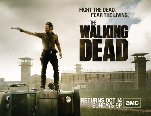
The Walking Dead – Season 3 – Poster Art – Frank Ockenfels/AMC
Of course I looked at The Walking Dead. A bad-ass character and a ruined environment- check.
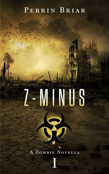
Here’s another zombie book. It’s all environment. A lot of zombie books have this bio-hazard symbol on them. It makes the genre clear.
Finally:
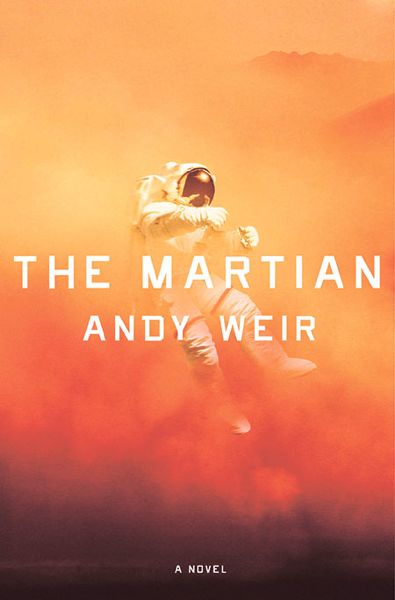
This cover, of a sci-fi, Robinson Crusoe-esque story of a guy abandoned on Mars, was my clearest inspiration- both for the story and the cover. It has man and environment, displayed very compellingly and elegantly.
The novel is a series of man vs. environment problems that the protagonist has to solve with creative use of science. My novel is similar- though he solves his problems not with science, but with art.
So…
DESIGN TWO
I draft a basic interpretation of this idea, with zombies in place of sand. They are my environment.
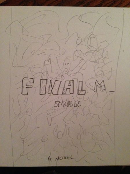
It’s very rough but you get the idea. Seems I was toying with the idea of ‘Final Man’ as a title here. Am glad I went with The Last instead.
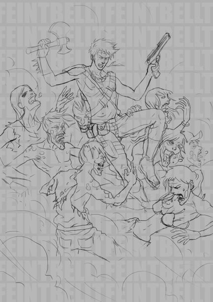
I put the job up on deviantart for $100, and get as usual like 30 responses. I comb through them and pick the guy who looks best- Francisco Ruiz. I give him the brief, this rough cover, plus all the reference images above. he gets to work on a sketch, and comes up with this:
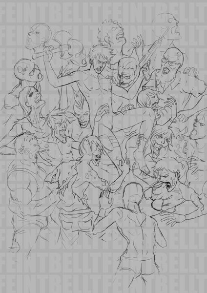
It’s a good start. The guy looks too young, and given his nakedness this looks a bit rapey, plus I want more zombies with more sense of him lost amongst them, but it’s good. I go back and get the next sketch.
At least he’s wearing clothes now. Still too young, too much ammo bandoliers, and his hair looks like he’s in a boy band.
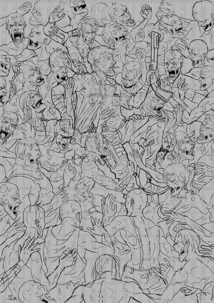
OK, now this is more like it! He’s a man not a boy, he’s holding one weapon, and the zombies are everywhere. I pay half the money and the work goes ahead.
The artist starts to color in. It’s looking good!

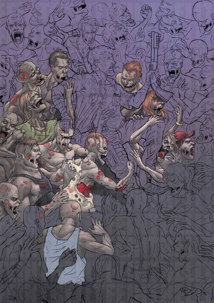
Here we’re at full color, almost there, though the main guy looks kind of weak-chinned now as his face has changed, and the image broadly lacks contrast.
I put it into photoshop and punch up the contrast, blur the edges, and start experimenting with fonts. This grunge font is called ‘Twisted Stallions’. At the same time the artist is working on minor changes.
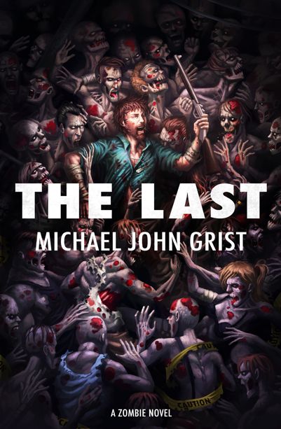
I don’t know what the artist did, but he looks less weak-chinned now. His shirt is blue which I prefer. There are fine level details like spit is coming out of his mouth as he screams, he’s wearing dog-tags, and also environmental features have been added like the Police Caution tape wrapped around the zombie at bottom right, and power lines running across the top right.
Wow, I thought, when I saw Francisco had done this. He is dedicated. This is good work.
Also I’ve gone with the blocky white title. It seemed best, since the image is so busy. To add a destructed, grungey font seemed like overkill. The eye wouldn’t know where to settle.
To try and off-set the busy image, and punch up the contrast more, I went into photoshop and did some sharpening, de-saturating, and selective darkening and blurring. It’s like painting with huge thick special effects crayons.
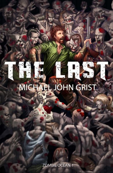
The main difference is the zombies are black and white, with splashes of red blood. the only real color is Amo and his shirt. I like this color contrast. There is also vignetting- darkened corners and edges- which I believe help frame the image. There’s a band of dark across the middle too, to help the title stand out.
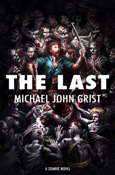
So, done? Almost. For three months the book was on sale like this- then I started with Francisco on The sequel design, The Lost, and I wanted to add some bits that I also had to add to this.
I hadn’t been totally happy with the level of contrast, or with the font. so I experiemented more, and came up with:
I zoomed in on the image a bit, cropping the edges and making Amo bigger. I re-did the de-saturation and darkening to punch up the contrast. I changed the font and figured out how to make it look all ragged- and was surprised how it didn’t seem to clash any more.
I also added the biohazard icon- sourced for free.
What do you think?
I think it’s been all improvement so far. Refining the cover, the blurb, the title have all really helped home in on what the book is, what it’s USP is, and who will enjoy it and for what reasons. It’s all there on the cover.
And the blurb? It evolved too. It always was short and sweet, inspired by the likes of Hugh Howey ad The Martian itself. State the premise in one or two lines, then get out.
When the zombie apocalypse hits America, not a soul is left alive.
Except Amo. He’s a comic book artist. He’s a video game world-builder. He’s mayor of his local coffee shop in New York.
He will survive.
It’s so simple. It doesn’t tell you enough? I knew that- because to say any more would be to venture into spoiler territory for the book’s major twists. I hoped reviews would help out here, by stating there were twists and they were fun.
I also decided to help that along. I thought- why not be bold? Provocative? So now the tagline above the blurb reads-
The zombie apocalypse like you’ve never seen it before.
In big letters like that. I also edited the book file so this message is the inside flap, first page after the cover. so people don’t forget what book they’re reading.
Afterward I added a line comparing it to other works, and describing what reads have in store for them-
‘Robinson Crusoe’ meets the zombie apocalypse, packed with gore, twists and existential angst.
The existential angst bit is true, but also intended as a bit tongue-in-cheek. The book has humor too, so I try to showcase that here.
Finally, I decide to spell out a bit ore what kind of twists we have in store, with a little more humor too, plus mention that while it is series, readers won’t be left annoyed by a cliffhanger-
A standalone novel that kicks off the Zombie Ocean series, continued in Book 2, The Lost. Burning questions will be raised and answered, like:
– How do you survive when the whole world wants to eat you?
– Where does hope come from when you’re the last one alive?
– Where are all the zombies going, and what on Earth do they really want?
CONCLUSION
So that is the book’s marketing package. Spelled out like this, it looks like quite a lot of work. It is, really. It’s fun though- difficult but one of the more fun bits of the whole writing/publishing process. I’d miss it if I was traditionally published- though before I got started with indie publishing it was the bit I dreaded most.
I have to sell my books? To people? I don’t know what to say!
Just say it boldly, cross your fingers, and be ready to iterate new versions when the idea comes.
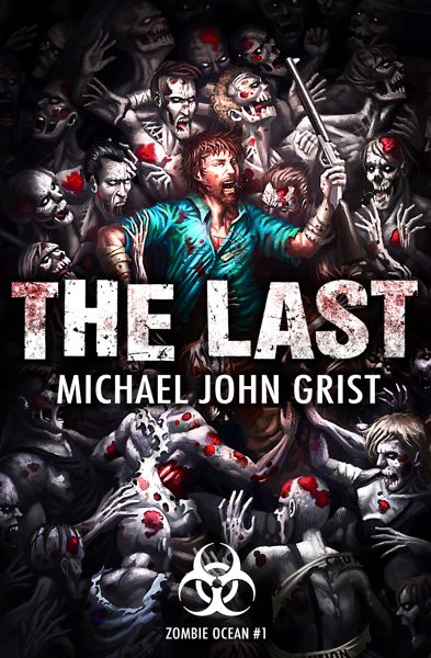
I’ll do a marketing post like this for all my books- starting with The Lost next, and then going back over Mr. Ruins (which has a new cover coming) and the others.
See other posts in the book marketing range here.
Meanwhile, you can buy The Last here :)-